Completed: 2021
Timeline: One week
Overview
The 1962 Seattle World’s Fair was a momentous occasion and a significant historic event for Seattle and the United States alike. This digital interpretation of the fair’s official souvenir program offers users modernized assistance in discovering and planning a visit to the fair.
This self-chosen project was completed as the capstone for SuperHi’s Visual Design + Branding course. The instruction was to take a print publication without a modern online presence and create a digital experience inspired by the source material. We were encouraged to enhance the user experience in any way possible using modern resources and design considerations. The project was completed in roughly a week and is not intended to be a completed site design.
The Publication
The goal was to find a print publication that was ideally published and circulated before the 90s in order to avoid copyright issues. Newer publications were also more likely to have an online presence.
After a few days of scouring the net, I discovered the scanned program from the Seattle World’s Fair on the Internet Archive. I really appreciated the full width, colorful title on the cover, as well as the consistent space-age design details throughout the program. While the contents of the program were enticing, they were rather unorganized and allowed considerable room for improvement in the categories of UX/UI.
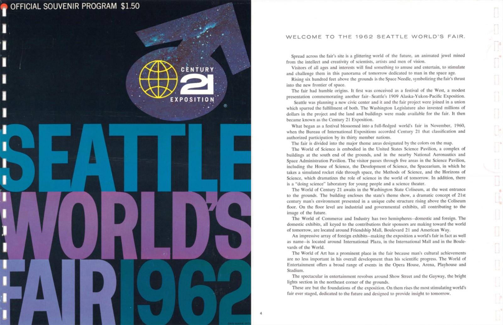
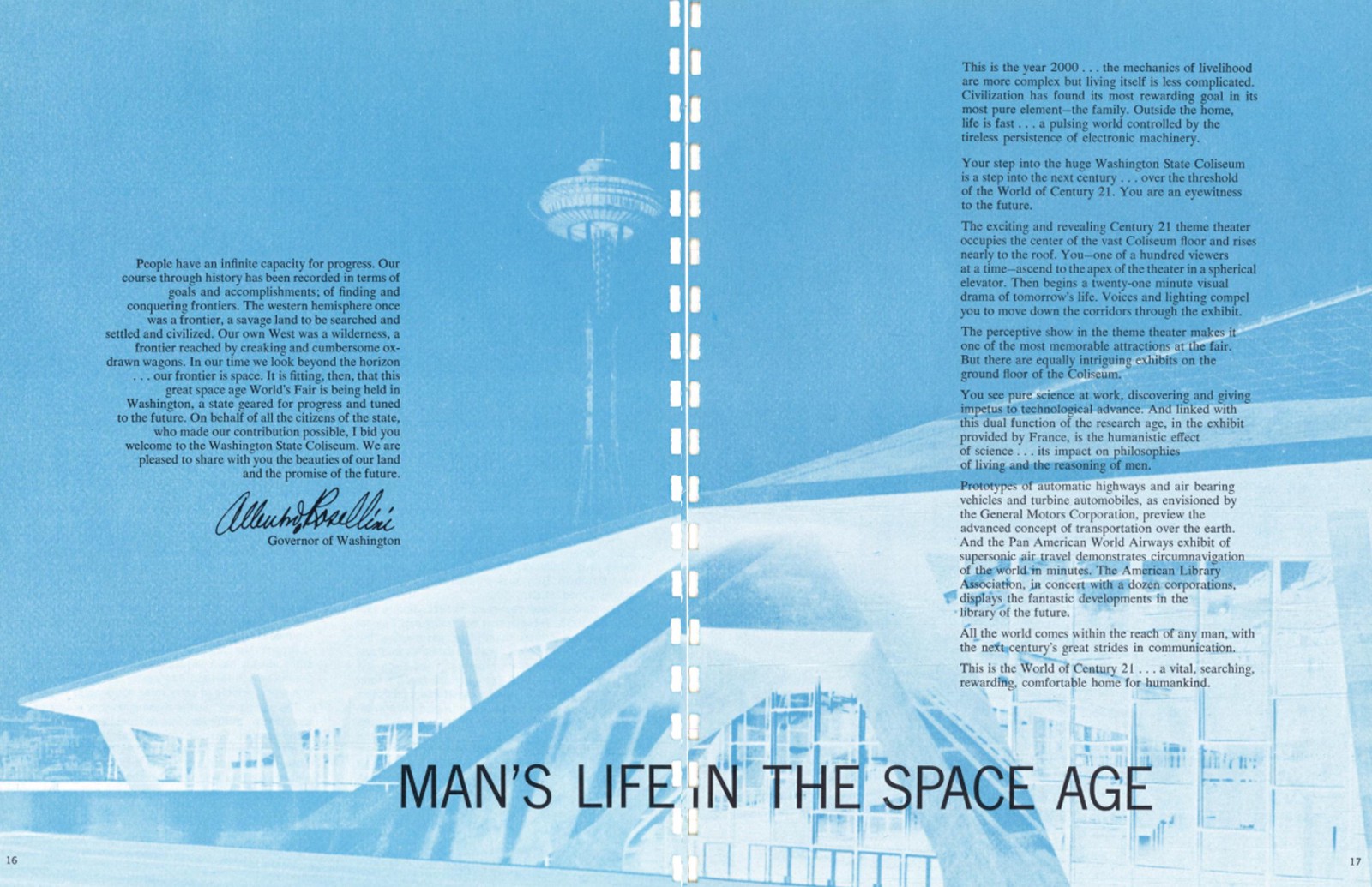
Left: Program cover and welcome statement; Right: Space age feature and excerpt from the governor;
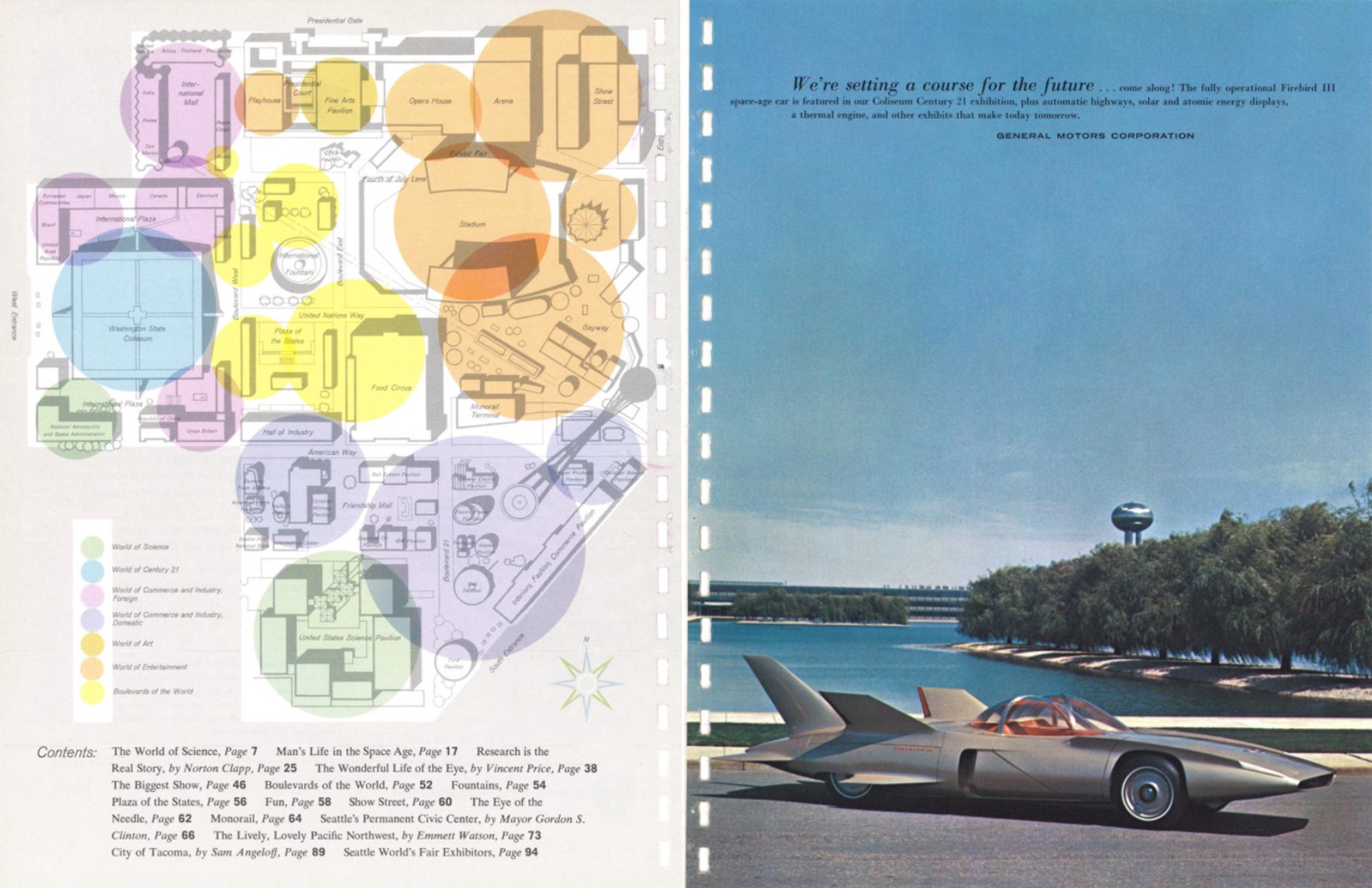
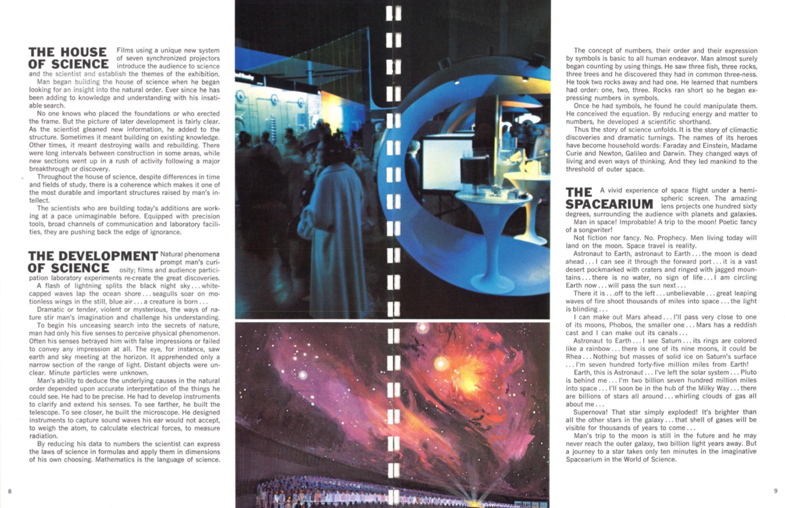
Left: Overlapping colorful circles with opacity + space-age car; Right: Stacked bold header font with space images.
Research
Event websites today are common and widely utilized in the discovery of event details and in directing customers to ticket sales. Thankfully, I’ve browsed many firsthand, and have even had the chance to design a few ahead of this project, though nothing to this scale.
For additional input, I questioned peers of varying ages and backgrounds regarding the pain points they typically experience when browsing event websites. Armed with their answers and my own unique experiences, I came up with a few key takeaways.
- Virtual or first-person experience video clips are a great way to help users visualize an experience ahead of time and incentivize ticket sales.
- Tickets should be easy to find — they should be promoted in multiple locations and should stand out from other content.
- The flow of the website should be logical and easy to navigate — the most important things should come first, and so on and so forth.
- The F.A.Q. page may be boring, but it’s one of the most important on the site. Make sure to have it, and make sure it’s easy enough to find, with thorough answers to every question imaginable. It should be cleanly formatted and easy to navigate.
Thinking through user flows
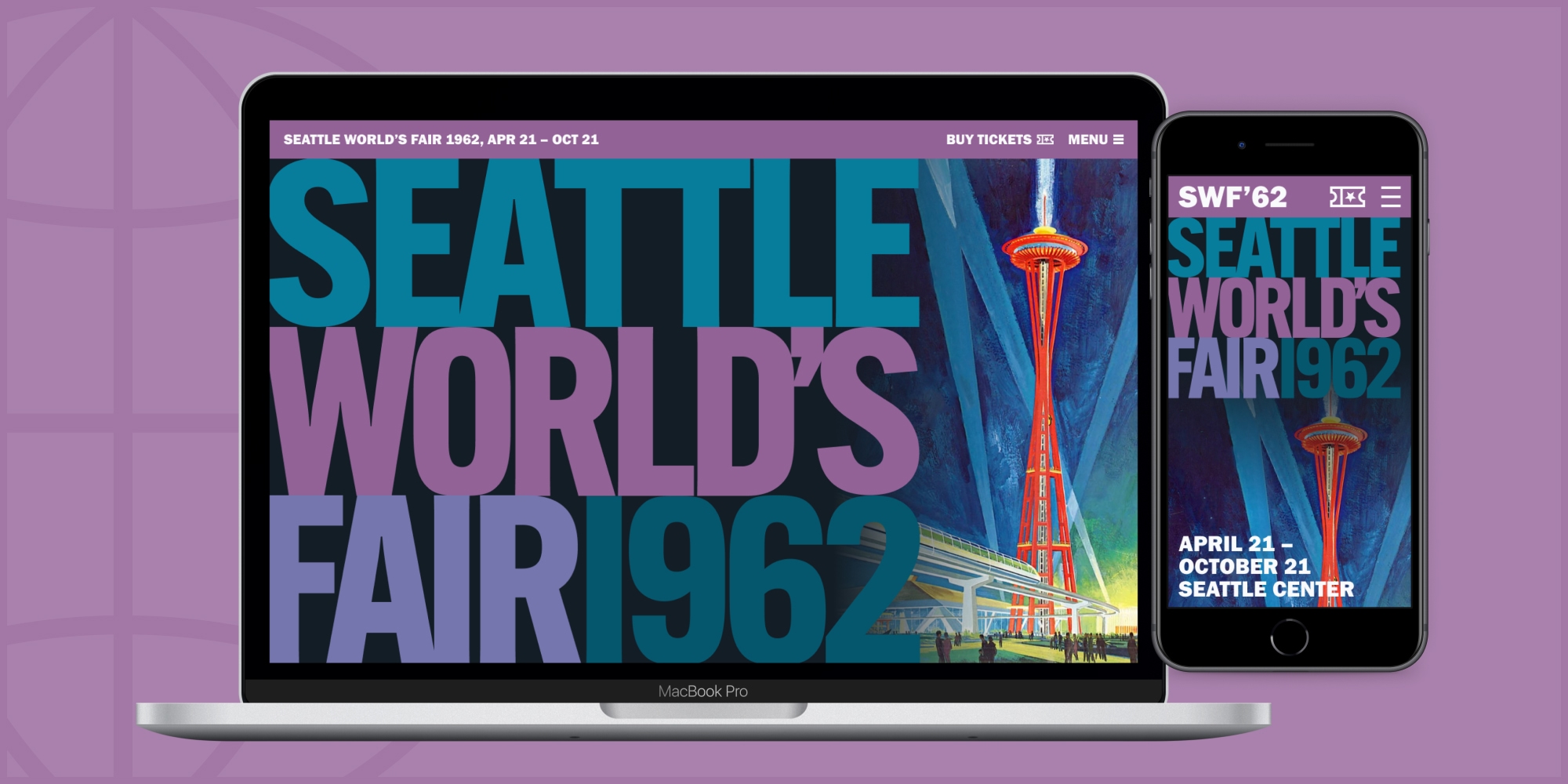
The initial question we were asked was whether or not the experience should be a responsive website, or rather, a native app. While I recognized that if the Seattle World’s Fair was being held today, it would most definitely have its own app, I also estimated that more users would interact with a website before ever downloading the app or attending the event. A responsive website also provided the opportunity to present the designs in various sizes and screen orientations.
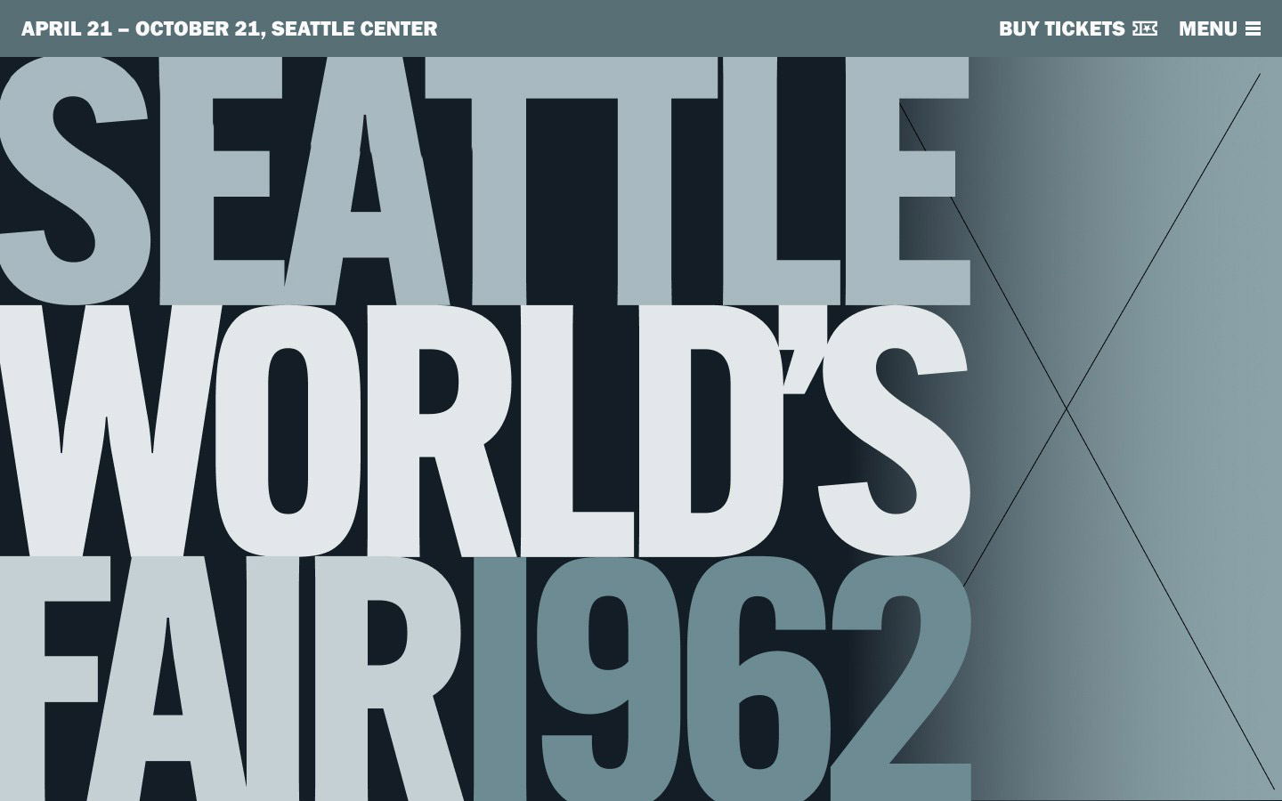
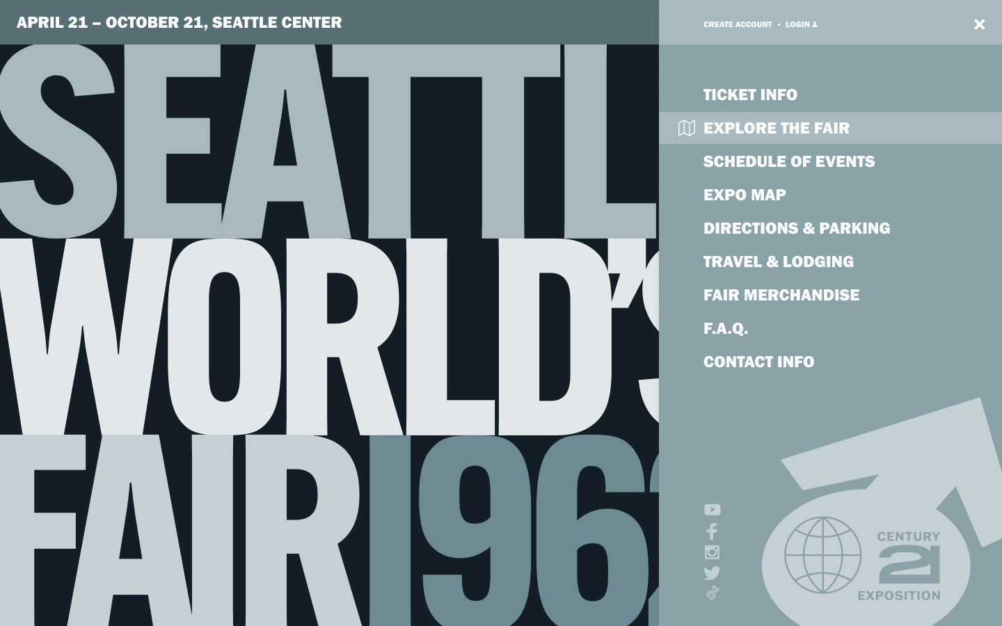
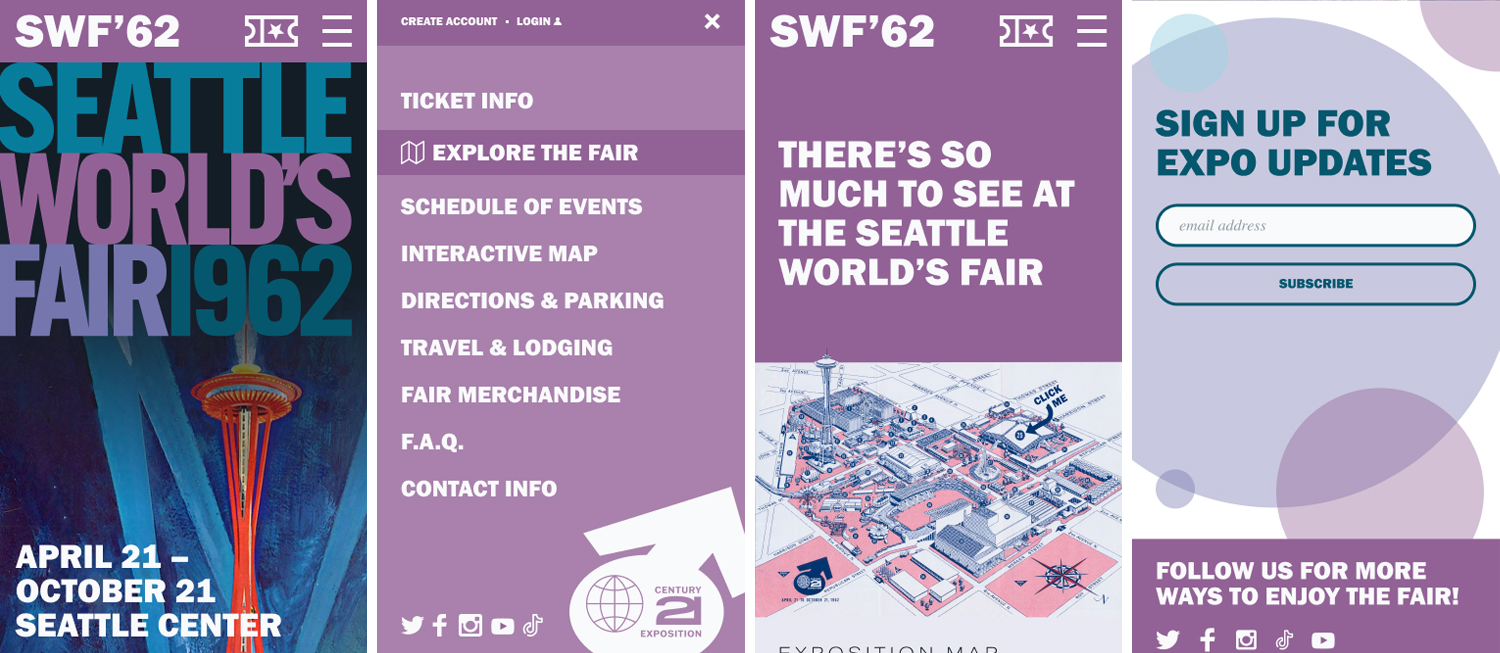
The Seattle World’s Fair was a big deal in 1962, and the full-page bold title on the cover spoke to that grandeur in an impactful way. I felt it was important to maintain that impact when users first landed on the website and knew I’d need to recreate the logo to do so. The two other most important things from my perspective were the dates and the ticket links, so I made sure those were present at all times in the header and otherwise uncrowded.
The first wireframe of the homepage constrained to a Macbook Pro screen
Once users started scrolling, I wanted to offer a similar welcome statement to the official program, which allowed for a clean break from the dark/bold entrance to the site. From there users followed a homepage flow with the following sections:
The Seattle World’s Fair was a big deal in 1962, and the full-page bold title on the cover spoke to that grandeur in an impactful way. I felt it was important to maintain that impact when users first landed on the website and knew I’d need to recreate the logo to do so. The two other most important things from my perspective were the dates and the ticket links, so I made sure those were present at all times in the header and otherwise uncrowded.
- Explore the Exposition — an overarching guide of exhibitor categories
- Ticket Purchase — a bold, spacious section with key ticket options
- Upcoming Events — major headliners that garner the most ticket sales
- Interactive Map — allows users an overhead perspective and details on what they might expect to find at each location
- Links to directions/parking and travel/lodging
- Newsletter Sign-up & social media links
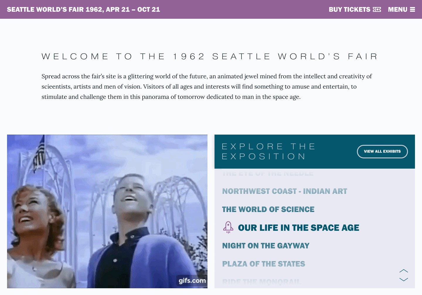
Welcome statement followed by promotional walk-through video and key exposition categories inscrollable box w/ unique icons
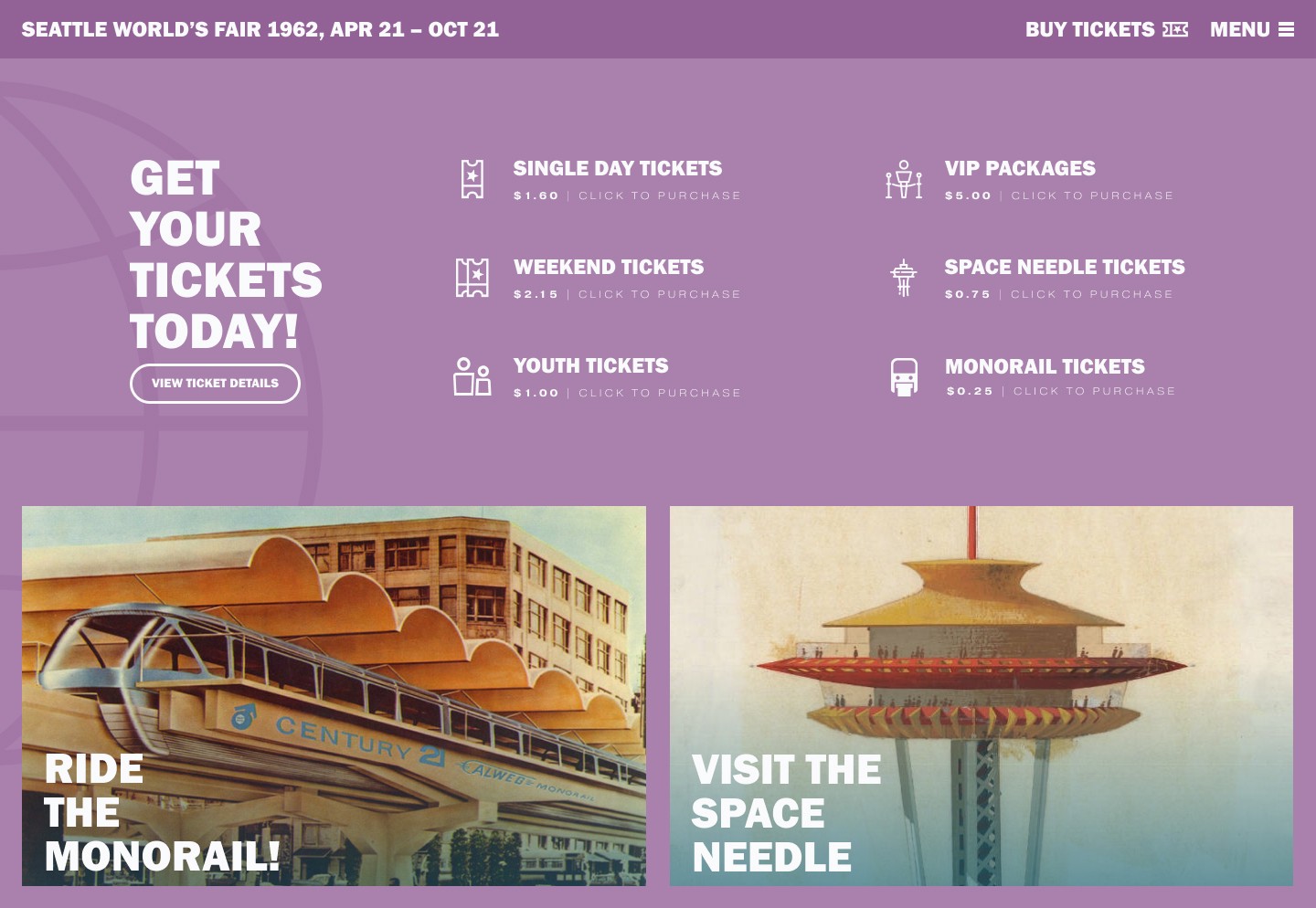
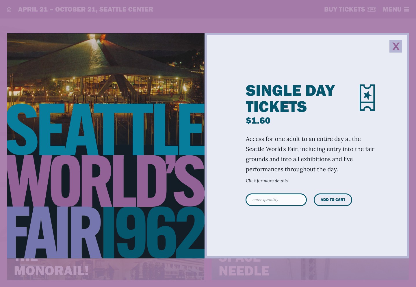
Left: Ticket sales prompt & space needle/monorail images & CTAs; Right: Ticket pop-up window dislpays once option has been selected
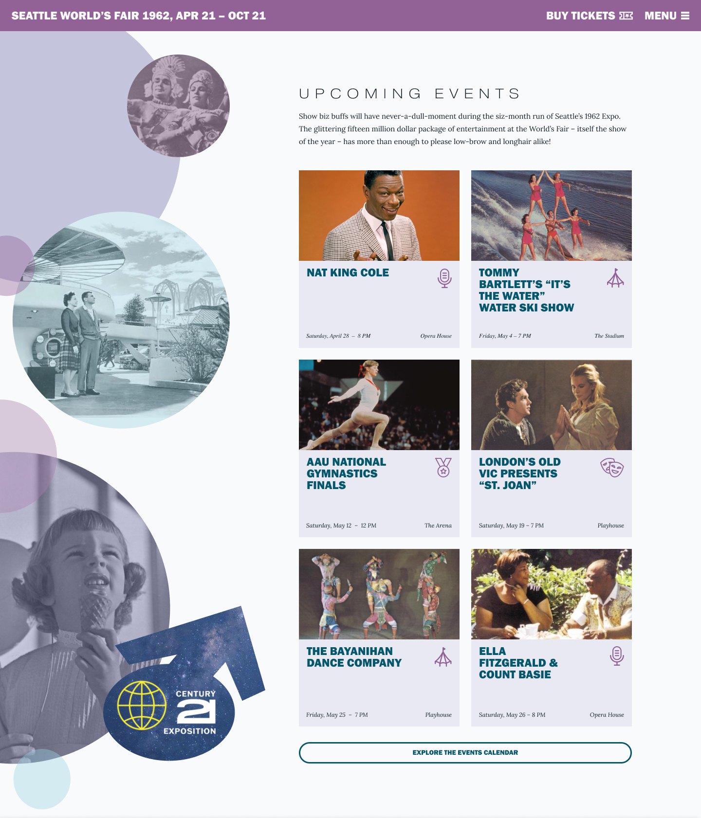
Upcoming events section of the homepage, with overlapping circle patterns, inspired by theoriginal text.
Aside from buying tickets and determining WHY you might want to attend the event, I also wanted to help users orient themselves before attending with the help of an interactive map. The original map simply features a list of each venue underneath a map with small numbers; while I loved the map design, it was obvious that this experience could be improved upon digitally using pop-up details linked to each number on the map. On mobile, users would be able to pinch to zoom and move around the map before tapping numbers.
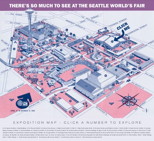
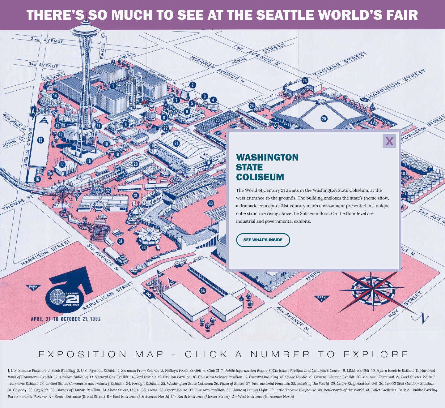
An interactive map offers venue details & further reading options when each number is clicked.HQ scan sourced from Cardboard America & treated in Photoshop.
Visual Design
The color palette for the site was unmistakenly sourced from the colors of the title on the cover. They aligned perfectly with the space & science theme of the event and provided an analogous grouping that was too good to pass up.
The typography was also inspired by the source text seen throughout the program. I particularly loved the bold, stacked text of the headlines on text-heavy pages, and did my best to replicate that styling using Franklin Gothic URW Heavy. I also included a set of subheader styles using a kerned out Pragmatica Extended, which was inspired by the original welcome statement and other use cases throughout the program. Lastly, I used Lora as the body font, inspired by the original use of Times New Roman, and found it to be a slightly more legible alternative.
Iconography was sourced from the archive at The Noun Project. My goal was for each to be outlined rather than filled in, but to maintain a bold and consistent stroke weight and similar angles.

Iconography inspired by the official program, sourced from The Noun Project and further altered for consistency.
In addition to the icons, I wanted to recreate the Century 21 logo that was repeatedly used throughout the program in various formats. I added a bit of blur to aspects of the layer to keep it from feeling tac sharp.
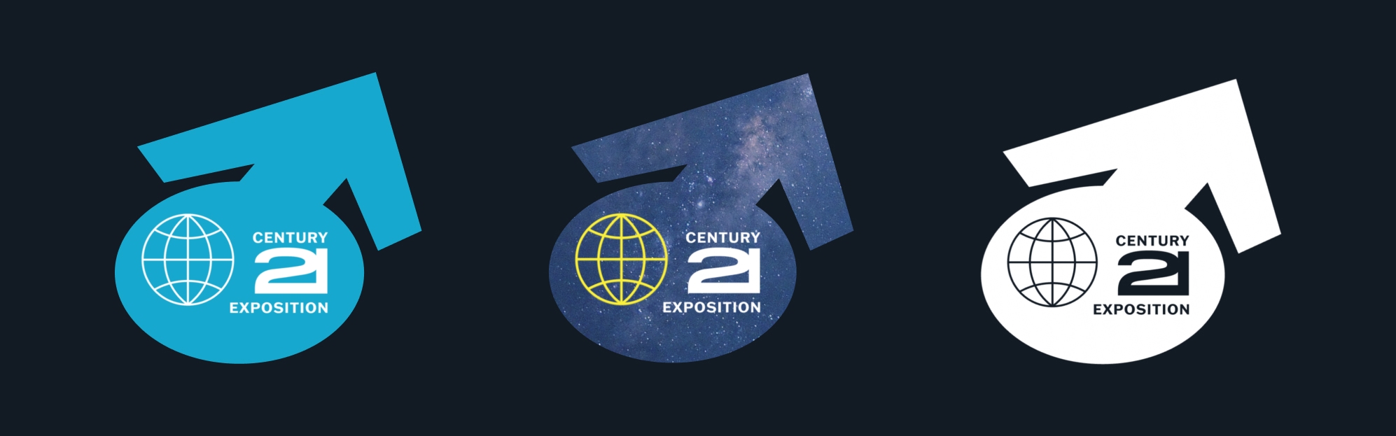
Redesigned Century 21 logos in various formats
Responsive Mobile Styles
Homepage features – landing page, menu (expanded), exposition map, newsletter block / social feature
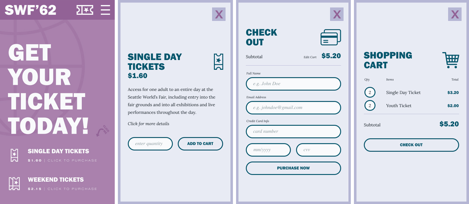
User flow for ticket purchase on mobile from the homepage
Challenges & Future Versions
Shortly after I started this project, it became clear that I bit off more than I could chewgiven only a week to design the site. Further renditions of the website would include additional features and break out pages that would touch on the following:
- An exposition page would highlight each expo category, offering overview copy and a shortlist of featured exhibits within the category, with buttons to see the full list within each category.
- Individual breakout pages, from there, would offer more detail on each category of the fair (i.e. science, space, live performances, carnival area, food & dining options, etc).
- A thorough F.A.Q. page would most definitely be needed, as mentioned earlier, and would require significant amounts of technical information that simply isn’t available.
- Flushed out pages with details on directions & parking, travel & lodging.
- A ticket details page would offer more information on the specifics of each ticket, along with select F.A.Q. question and answers specifically related to ticket sales/returns, etc.
- Featured pages on both the Monorail and Space Needle would eventually be completed, offering videos of each, detailed descriptions and links to purchase tickets.
- Events would be featured comprehensively on an event calendar page, complete with a search function, options to filter by category, and pop-up pages with details for each individual event.
- Once a venue has been selected from the interactive map and the details button has been clicked, users would be led to a more detailed page with a venue-specific schedule of events that could be expected therein.
- A fair merchandise page would showcase shirts, hats and other gear for sale to customers. Since this site is mostly intended to get people TO the fair itself, I decided to downplay the merch as a homepage priority.
- There is a great opportunity to tell a more custom story regarding the history of the World’s Fair and the international aspects, including participating countries, shared technologies, etc.